
The page builder
A real visual builder. Build once, reuse everywhere.
Drag-and-drop with nested sections, columns and full-page templates, a live front-end editor, and synced Global Templates — nearly 70+ elements, all open source, all shipping clean semantic markup.
Download free See all 70+ elements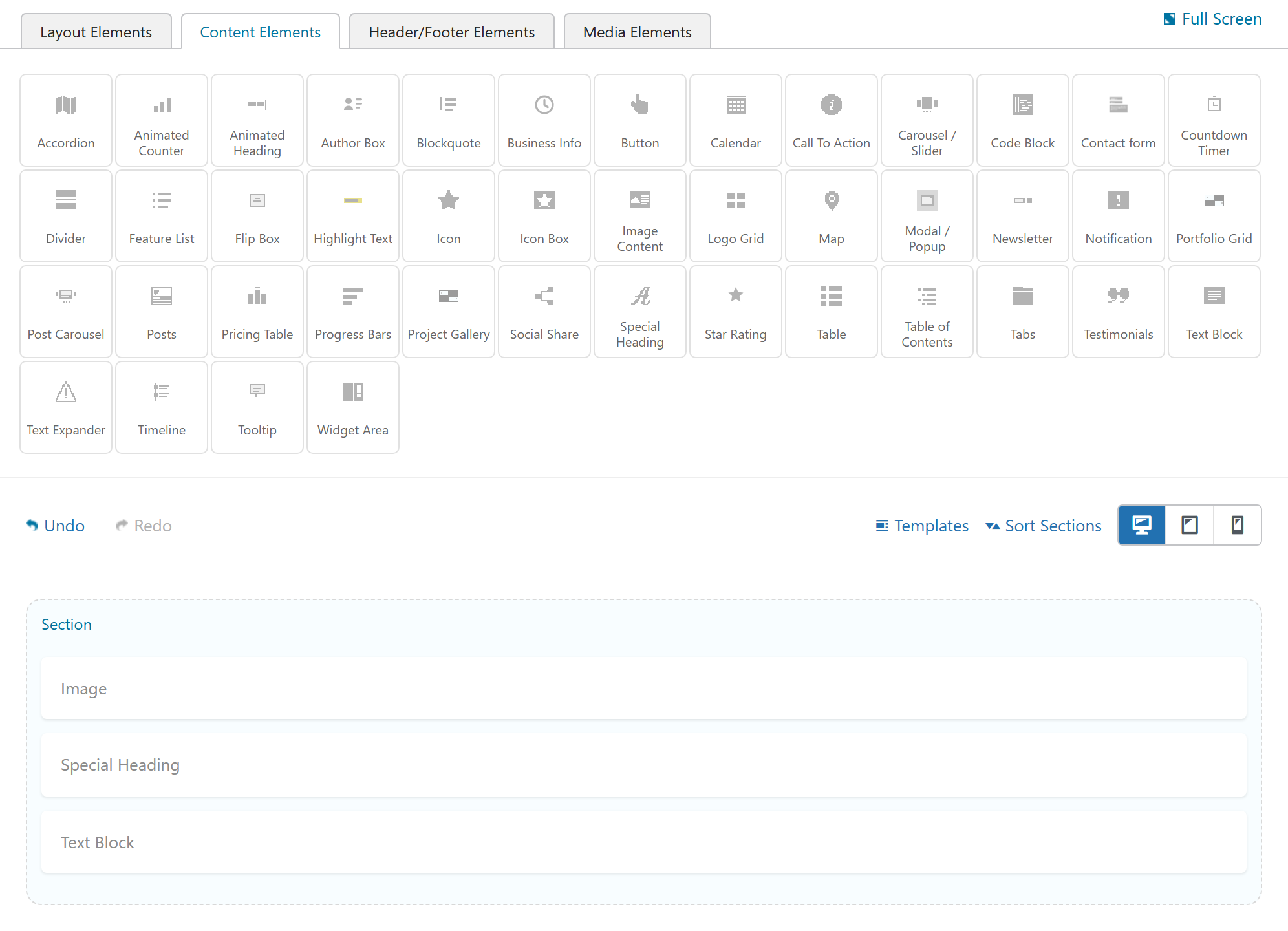
How it works
Drag, arrange, tune.
Drag elements in
Pull any of the 70+ elements from the panel onto the canvas. Smart placement builds the section and column scaffold for you.
Arrange the layout
Sections hold columns nested one level deep, rows, and a boxed or full-width Container for full-bleed bands.
Tune the options
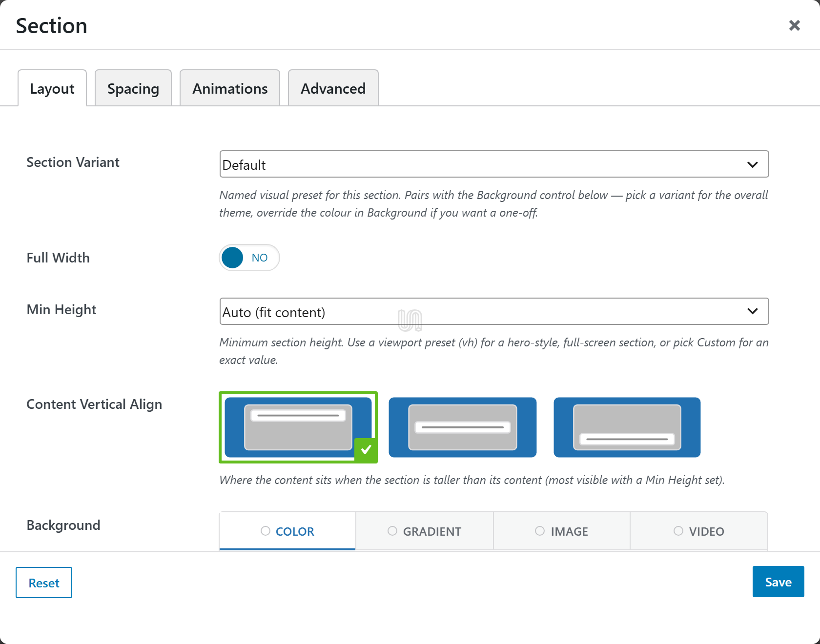
Per-device spacing, widths and layout for phone, tablet and desktop. No CSS required.
Build once, reuse everywhere
Global Templates that stay in sync.
Save any section or column as a Global Template and the builder stores it as a synced reference, not a copy. Edit it in one place and every page that uses it updates automatically.
-
Global Sections
Render at the root with no extra wrapper, flagged with a violet GLOBAL badge and an Edit Global Template pencil right on the canvas.
-
Global Columns
A real column, at its saved width, whose content is a single synced reference.
-
One source of truth
Perfect for headers, footers, calls-to-action, contact blocks and pricing.
Structure
Real structure, not just stacked blocks.
Nested columns & sections
Put columns inside columns, one level deep, for genuinely complex layouts.
Container element
Drop a boxed or full-width Container into a section for full-bleed bands beside contained ones.
Full-page templates
Save and import an entire page body as a portable JSON file — the per-element Custom CSS travels with it.
Bleed sections
Edge-to-edge backgrounds with the content kept in a tidy, readable container.
Header & footer builder
Design your site chrome visually with the navigation elements, then assign it per page or site-wide.
Sort, duplicate & snippets
A Sort Sections dropdown, one-click cloning, and reusable [snippet] blocks you can drop anywhere.
Live editor
Edit on the real page, not a preview.
Launch from the "Edit Live" admin-bar button and design on the actual rendered page. Hover any section, column or element to select it and change its options in place — what you see is exactly what ships.
Download freeResponsive
Design for every screen.
Device preview toggle
Desktop, Tablet and Phone buttons render the canvas at realistic widths (768px and 375px).
Per-device controls
Separate widths, offsets, mobile order and position on every column, for each breakpoint.
Three breakpoints
Phone, tablet and desktop, with a responsive grid throughout — no media queries to hand-write.
Design system
Component Presets, applied by name.
Set your design tokens once and reuse them across every element — then export the whole system to clone it on the next site.
Color presets
Named brand colors backed by CSS custom properties (--color-*).
Button presets
A button-style library with per-state colors, sizes and animations.
Border & box presets
Reusable borders, radii and shadow/background boxes in one picker.
Typography presets
A named type scale — body, lead and heading sizes — used everywhere.
Spacing & gap scale
Named margin, padding and gap steps, responsive per breakpoint.
Export / import
Download your preset libraries as portable JSON and import them into another site.
Animations
Motion, without the jank.
40+ animations
The full Animate.css library — entrances, attention-seekers, flips, zooms and slides — on any element.
Per-element control
Pick the effect, then tune duration, delay, iteration, fill mode and easing on its Animation tab.
Light and considerate
Animation assets load only when used, and motion honors the visitor's prefers-reduced-motion setting.
Clean output
Markup your developers will thank you for.
Semantic HTML
Clean .fw-row / .fw-col-* grid classes and per-element classes — no wrapper-div soup, no attribute bloat.
No Bootstrap bloat
The plugin no longer bundles or enqueues Bootstrap; the shortcodes are self-sufficient and styling is opt-out.
Conditional assets
Only the CSS and JS for the elements and designs actually used on a page get enqueued.
Accessible by default
Keyboard-friendly interactive elements with ARIA support, and motion that respects reduced-motion.
Hooks & filters
Register custom elements and section types, extend list styles, and gate per-instance asset loading.
Any theme
The Unyson+ theme is optional. The builder runs on any WordPress theme, with namespaced CSS.
What's new
Lots of recent updates.
-
Global Templates
Synced Global Sections and Global Columns — edit once, update every page.
-
Container element
Full-bleed bands sitting alongside contained content.
-
Device preview toggle
Desktop, Tablet and Phone right in the builder toolbar.
-
~20 new elements
Image Box, an 18-design Gallery, Before/After, Timeline, Flip Box, Modal, Tooltip, Pricing Table and more.
-
Smart click-to-add
Click an element and the builder builds the section and column scaffold it needs.
-
Dropped Bootstrap
Lighter pages — the shortcodes are now self-sufficient.
-
Preset & template export/import
Move your design system and full-page layouts between sites.
-
Hardened security
CSRF nonce protection across every builder AJAX endpoint.
Build your first page in minutes.
Install the plugin and theme, open the builder, and start dragging.
Download Unyson+